waitr.
UI/UX Concept
Course
Interface Design
Team
Saba & Joshua
Supervisor
Thomas Techert
Year
2018

waitr.
Our course Interface had us reimagine how a POS (Point of Sale) works. The goal was to create a more friendly user flow and a simplified interface. We decided to take a closer look at how waiters have to operate on a day-to-day basis, specifically those with a mobile terminal — which lead us to waitr.
Persona.

Fabian
Guest
23, Apprentice

Lisa
Waitress
21, Student
To get a better understanding what our point of sale has to offer, we created a persona of the guest and the waiter. The guest wants to recieve his order as fast as possible, while the waiter wants to fulfill the order with ease, especially when it comes to common requests or changes to an order.
Cardsorting.
After looking at the current system to see what's wrong with it, we used cardsorting to create a better structure. At this stage of the process we also decided which elements to put on each screen, how they result in a better userflow, etc.
Mindmap.
To see how much information needs to be put on each screen, we created a mindmap. The mindmap contained everything from type of drinks and food to information the waiter needs to be able to acess at all times, this helped us figuring out where information is needed and where it becomes too crowded.
Say hello.
waitr is here.
Say hello.
waitr is here.
Say hello.
waitr is here.
Say hello.
waitr is here.
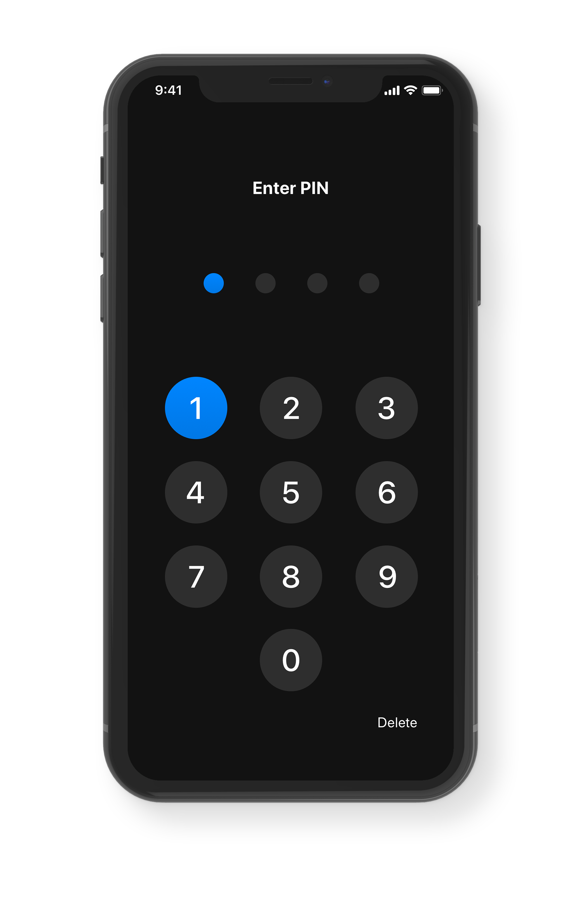
Password protected.
Each waiter has their own unique identifier which lets them log into the app and manage their personal account, see statistics and their assigned tables — the PIN also protects from abuse in case the phone gets lost.
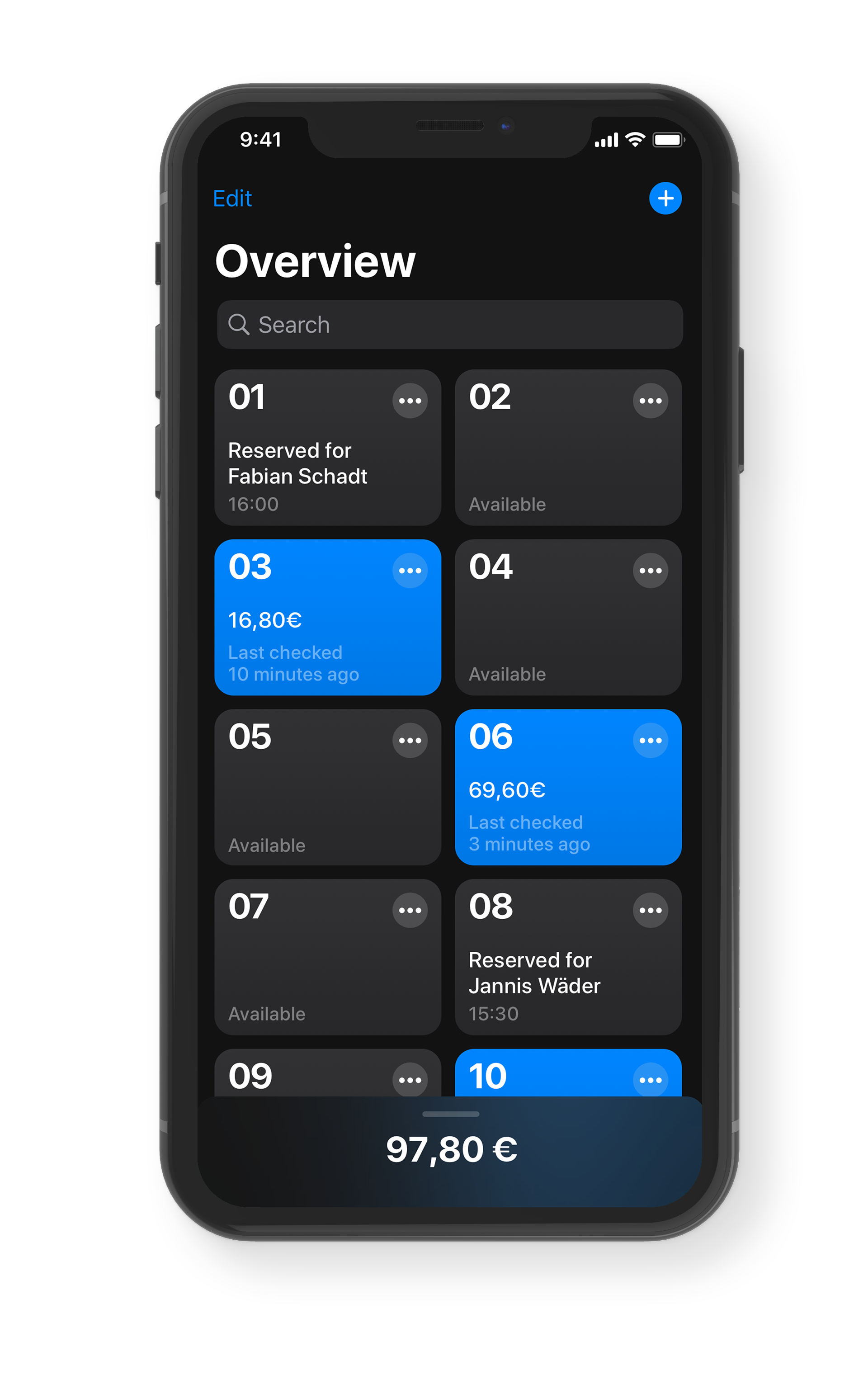
Everything at a glance.
Track everything you need to make your life easier — see which tables are free, where there's still an order to fulfill and if you haven't been to a table for some time — when the red dot shows up you should check on your cusotmers.
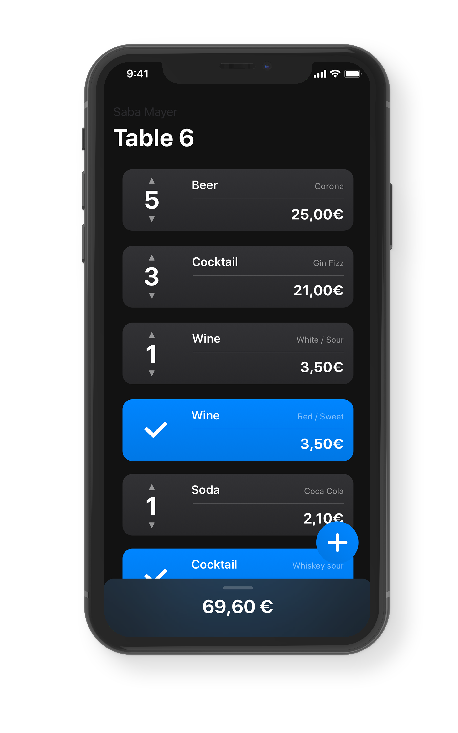
Take a closer look.
Manage each table individually by tapping on it in the overview, you are now able to see which orders you still need to bring to the table and mark it as completed once you do so — and of course you can see the open tab. In case you get an order that's already on the list, simply scroll the number to the new amount, if someone cancels an order scroll down.
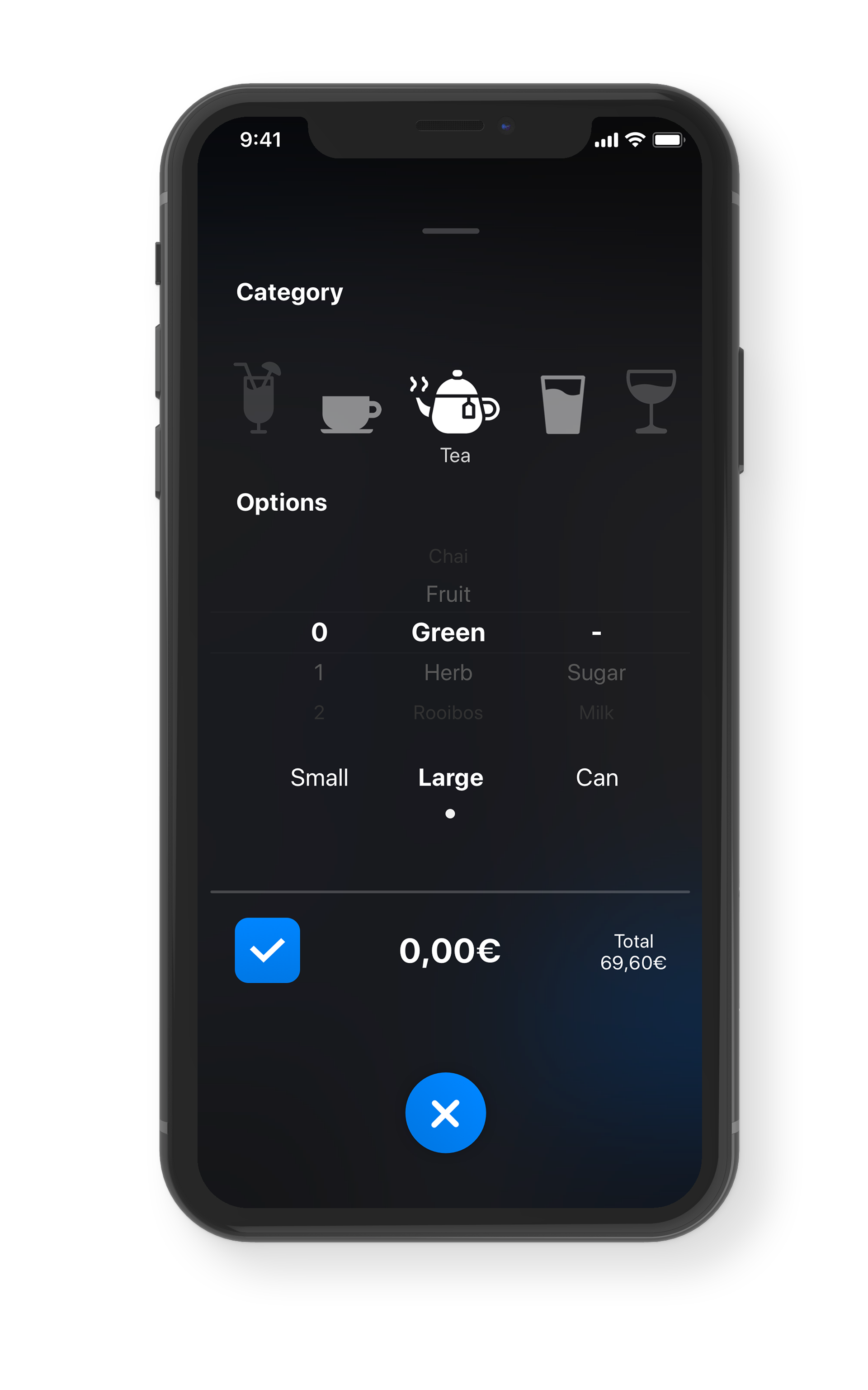
Quickly place an order.
Simply tap on the blue button available in each table overview to place a new order, a list of all available items lets you quickly chose the desired product and even customice it in case there are any special wishes.

Intuitive control.
Gestures are a key feature of waitr since waiters have only one hand available to them most of the time, which is why interactive elements are either placed in thumb range or reachable without too much effort.
Checkout, fast.
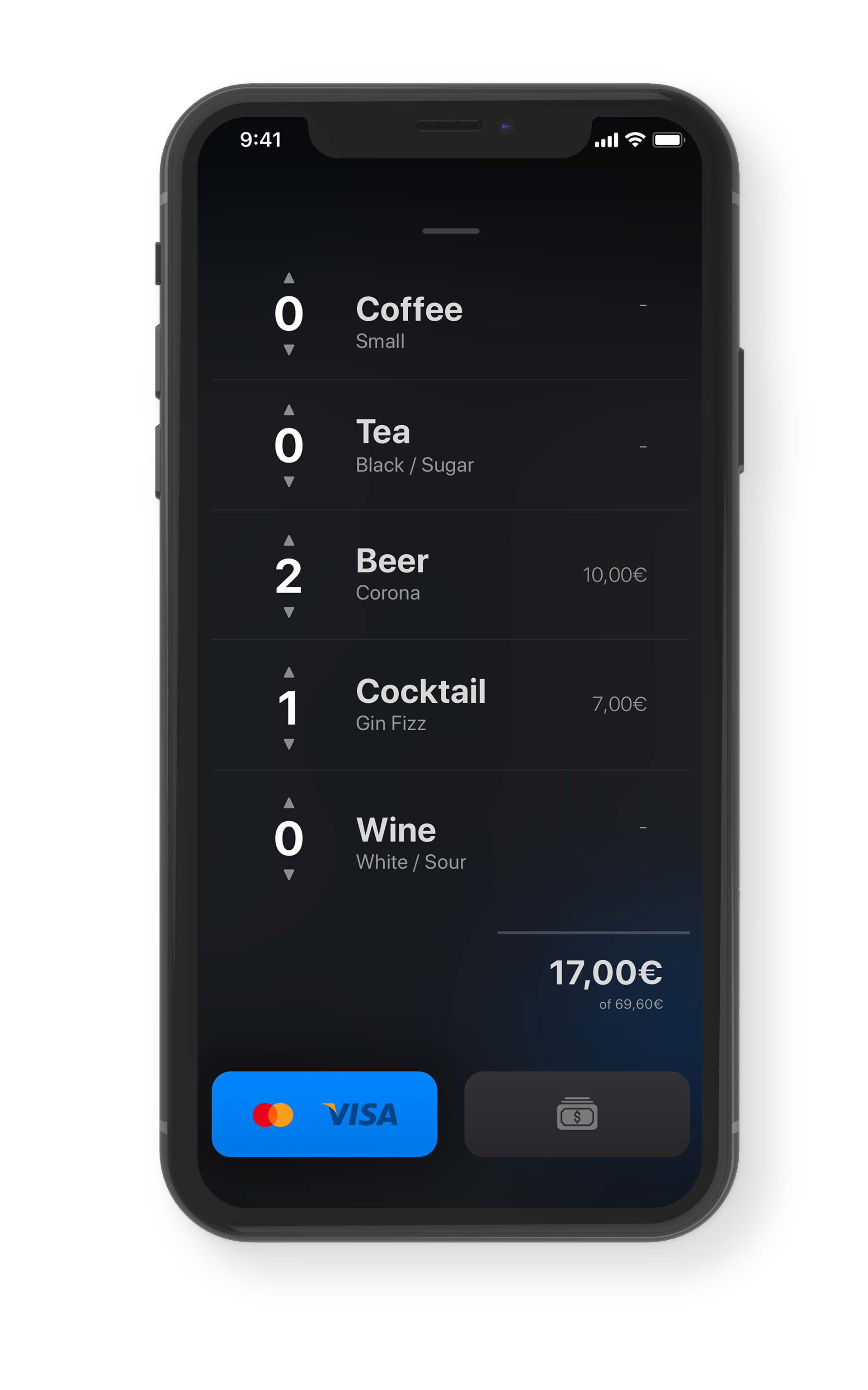
If a customer wants to pay simply swipe up on the table overview, each order will be presented to you — 3 people had a beer but only 1 wants to pay? Not a problem, adjust the individual amount of each item or simply leave everything at 0 if someone is generous enough to pay the tab for the whole table.
How much was it again?
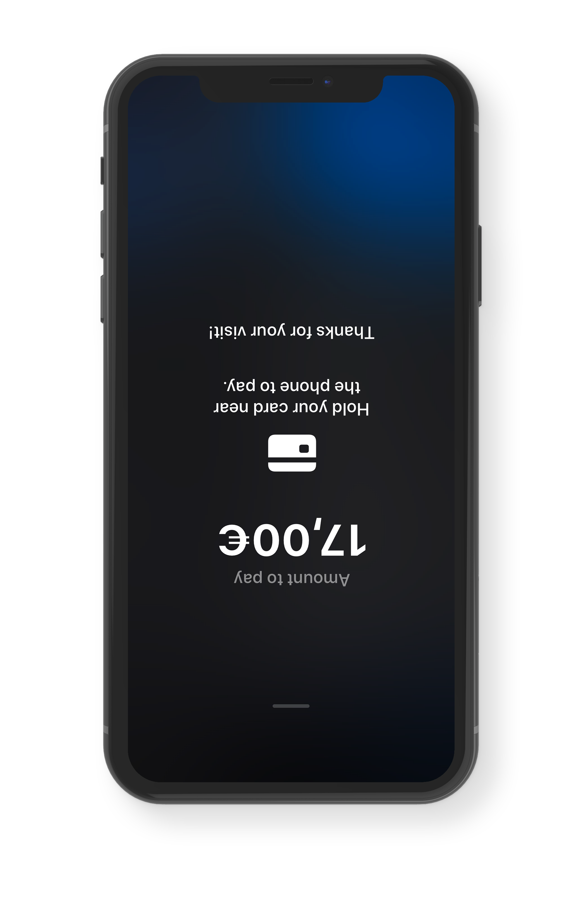
A loud environment or customers with a short memory span? Don't worry, just turn your phone upside down and show the customer the price again.


Other Projects

Copyright © 2022 Joshua Dessol
Privacy Policy Imprint Made with ❤️ in Germany


